Brave Rewards
-
Company
Brave
-
Role
Product Design
-
When
2020-'21
Project Overview
Introduction
Brave Rewards was still in its early design stages when I joined, which hindered its visual and functional scalability. Our goal was to refresh the product to enable planned features and support future growth.
Key Goals
-
Clearer Display of Estimated Earnings
Helping users find important information faster
-
Improved Product Navigation
Group and organize features and controls more intuitively
-
Visual Alignment
Ensure consistency across the Brave Rewards ecosystem
The Journey
Drilling Down
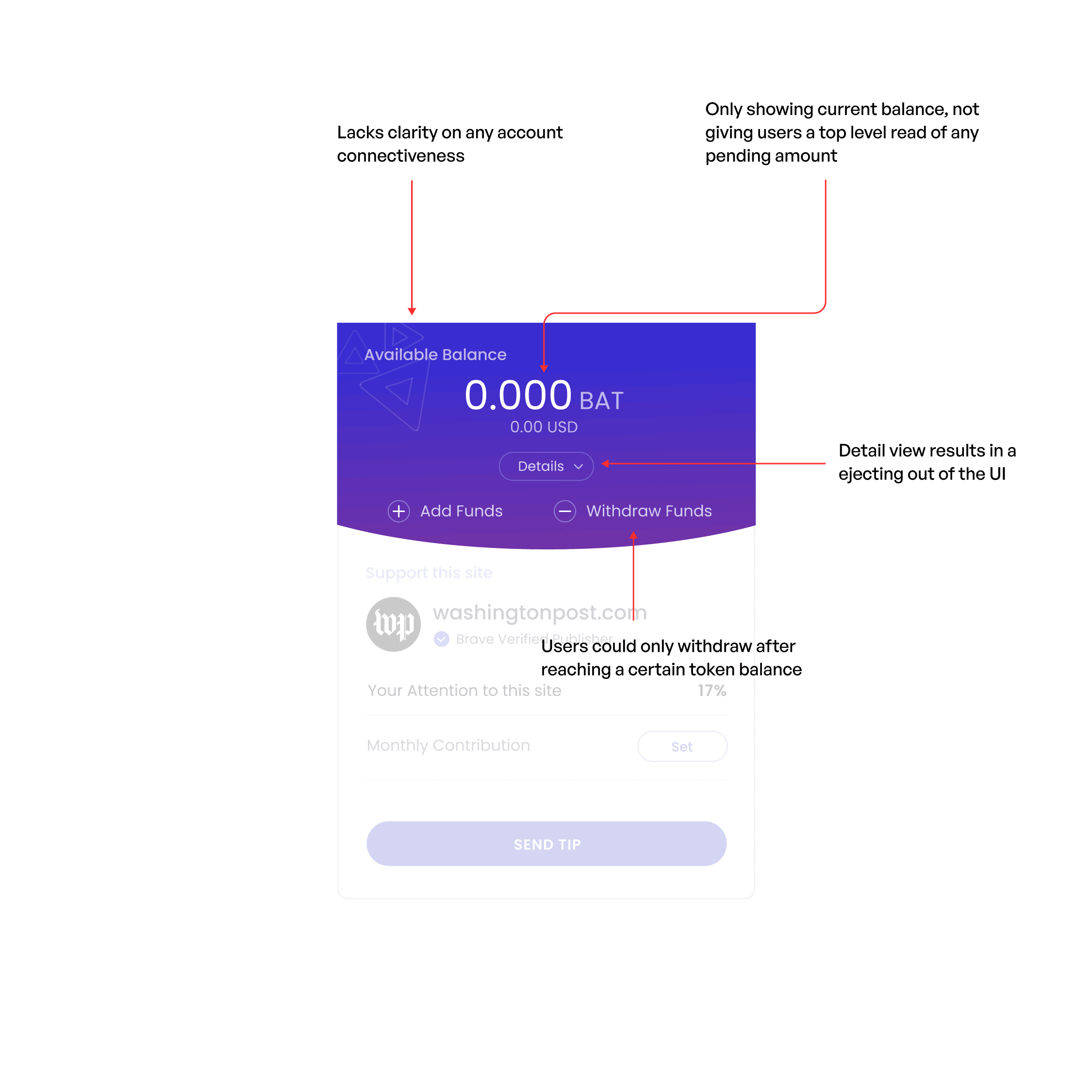
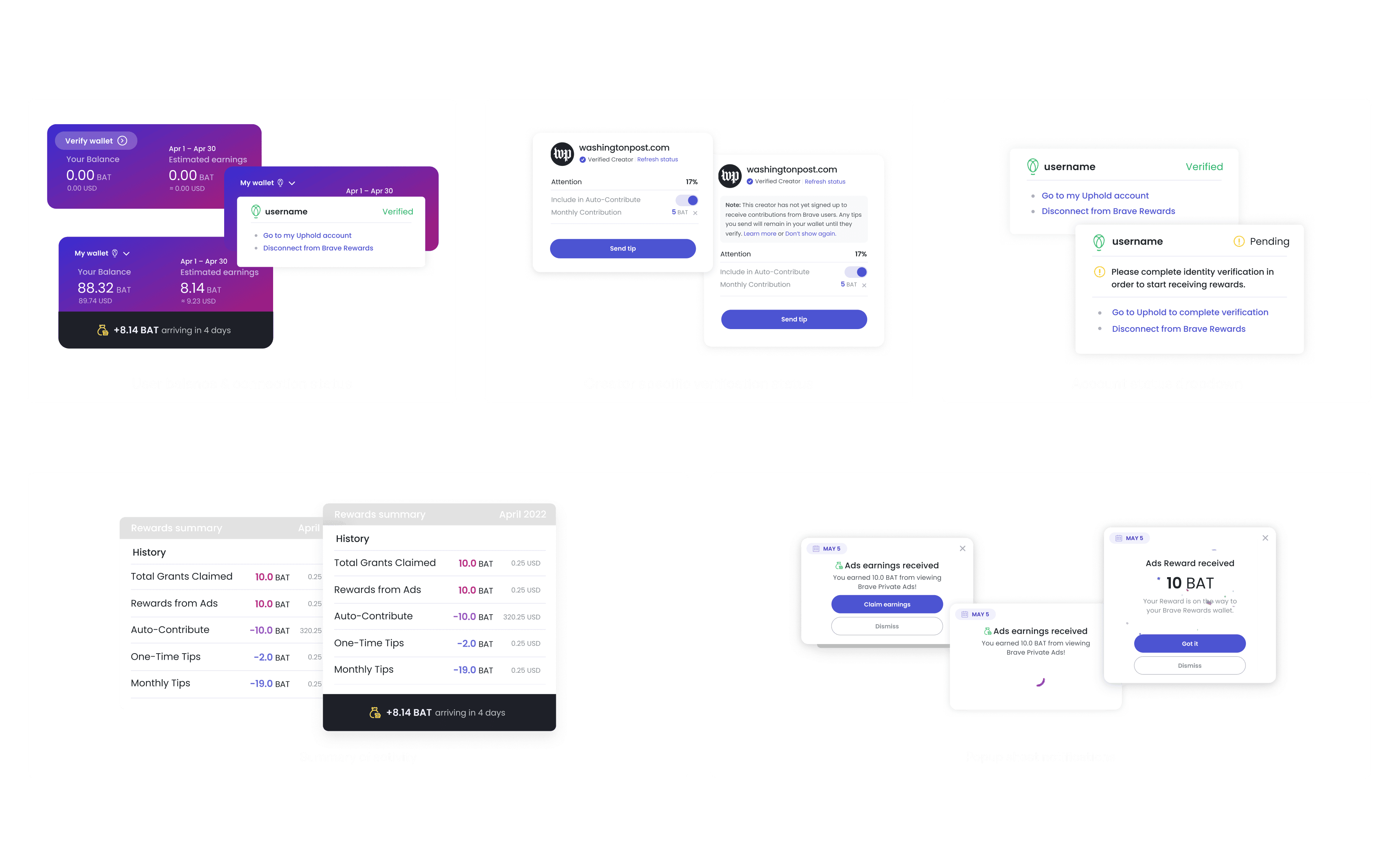
I began dissecting the current elements of the Brave Rewards Wallet to better understand what material issues were present.
Narrowing In
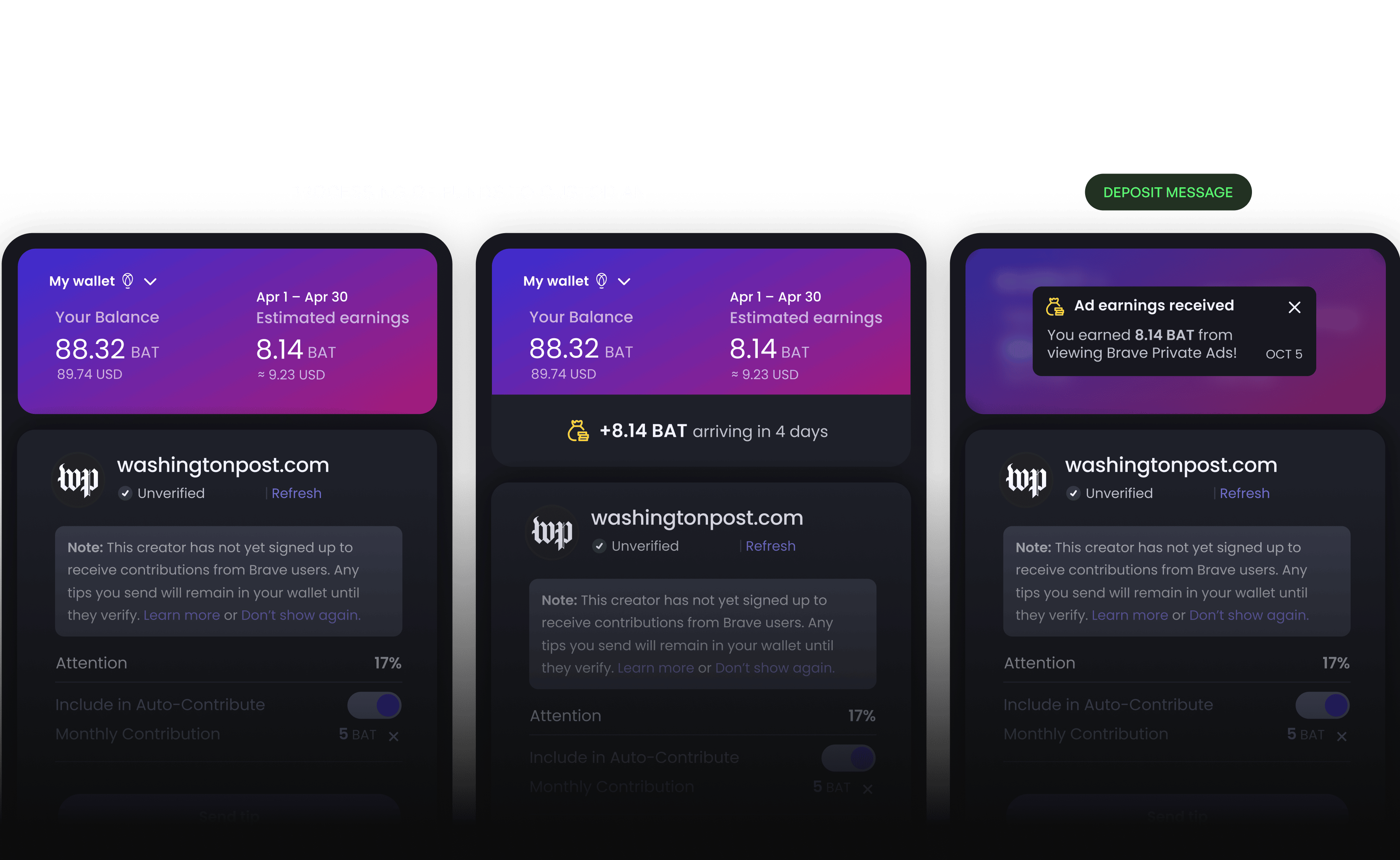
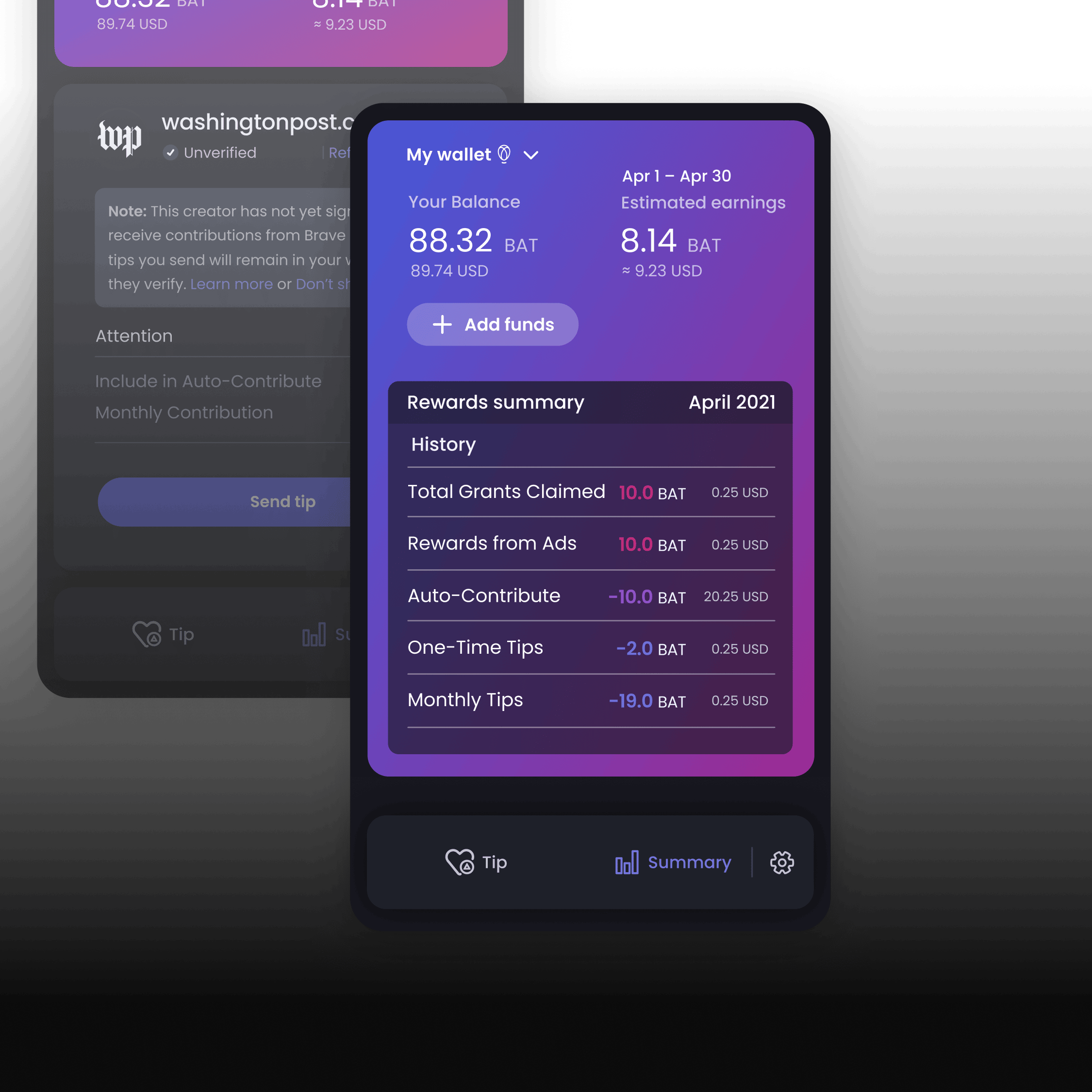
Addressing each element at a time, such as the wallet balance display component.
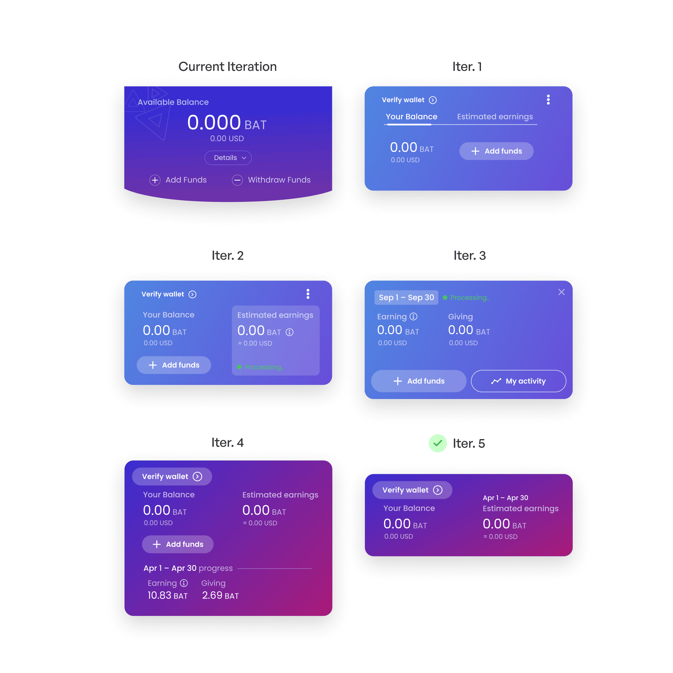
Iterating
Explored various panel components to balance user needs and reduce cognitive load.
Building the Library
Developing streamlined components to ensure consistency across mobile and web platforms.
The Journey
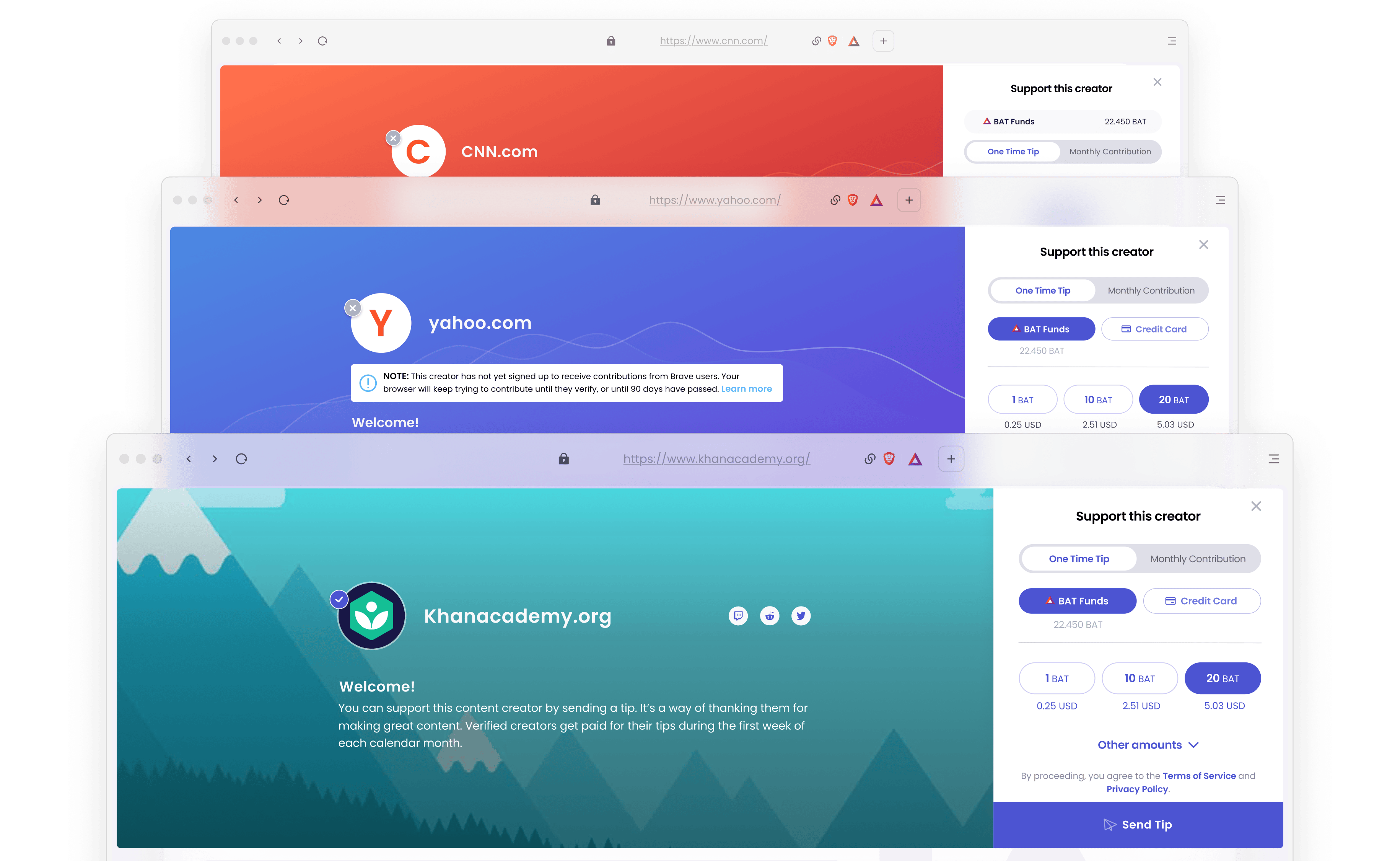
Trust & Transparency
The loudest concern from users was the lack of transpaency of their funds within the ecosystem. This was addressed during the Brave Rewards refresh.
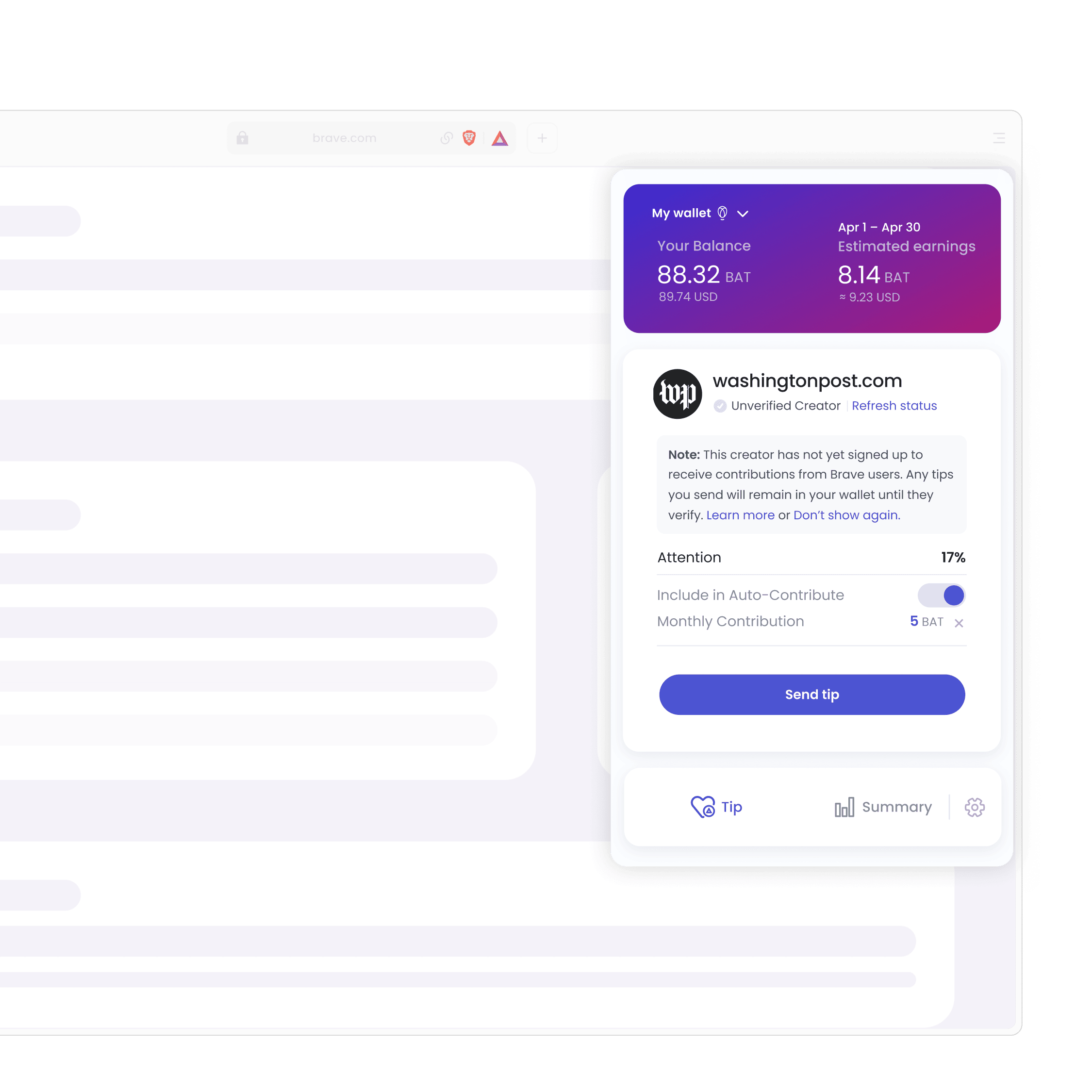
Earnings Front & Center
One of the biggest wins was surfacing estimated earnings front and center. This seemingly small change significantly boosted user trust and product transparency.
Feedback Signals
We conducted regular user interviews to gain qualitative insights, read user reviews for pain points and suggestions, and created a feature request system to encourage active user input.
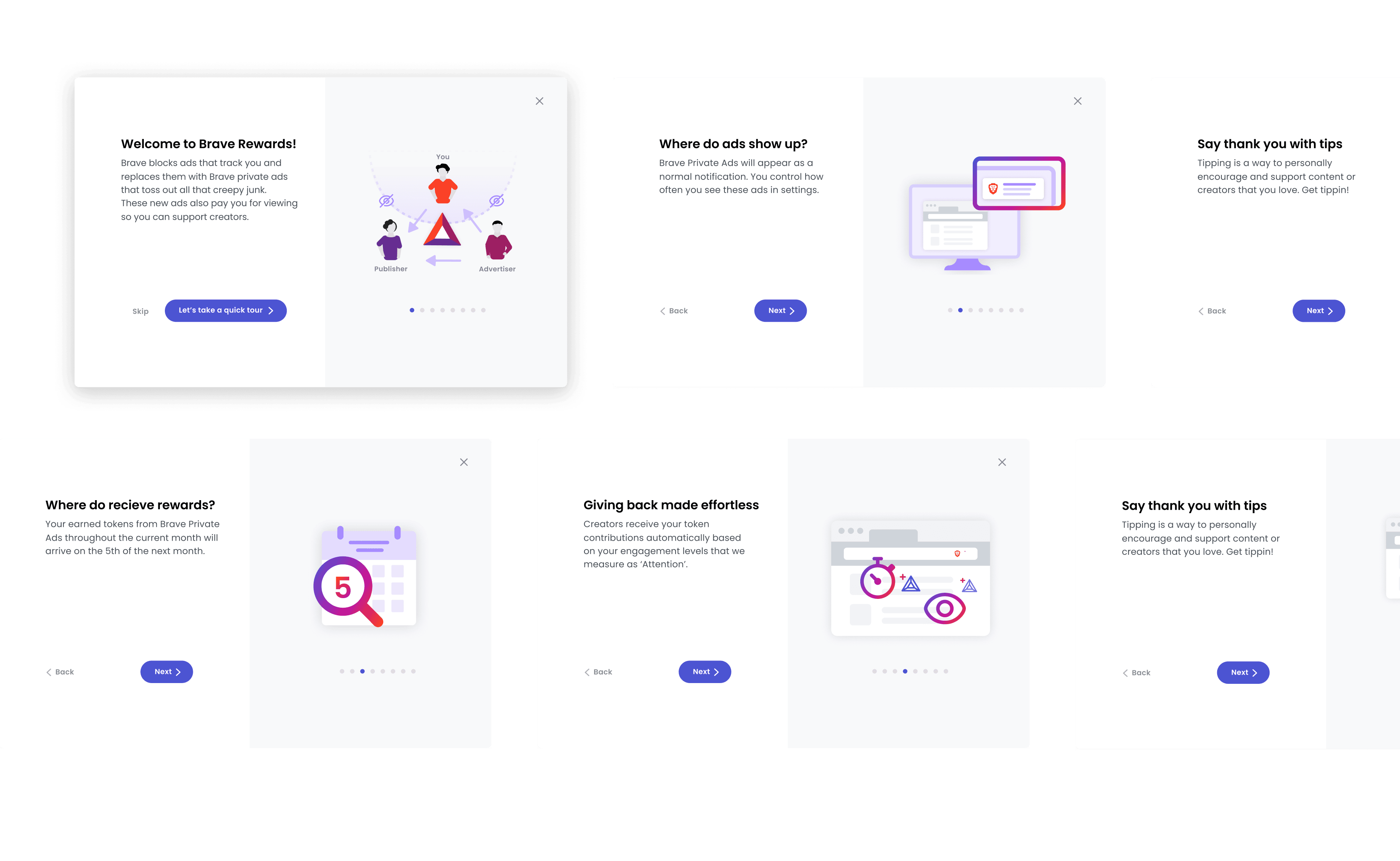
Onboarding Added
A new onboarding experience was introduced to help users better understand Brave Rewards from the start. This guided flow educates users on earning, tipping, and wallet management.
The Outcome
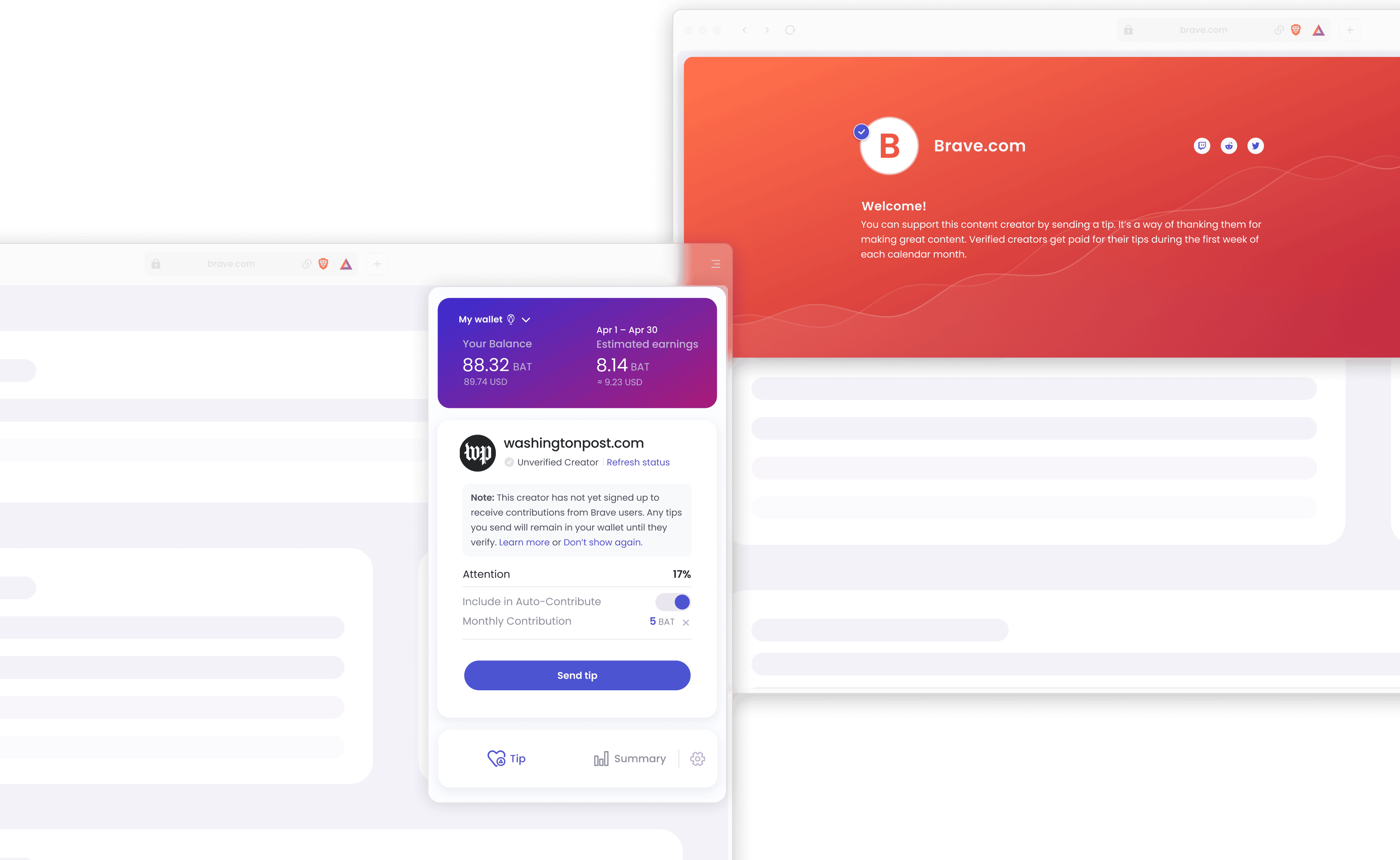
Tipping Banner
The tipping banner connects creators and supporters in the Basic Attention Token (BAT) economy. My job was to create a more engaging and flexible experience for creators and consumers.
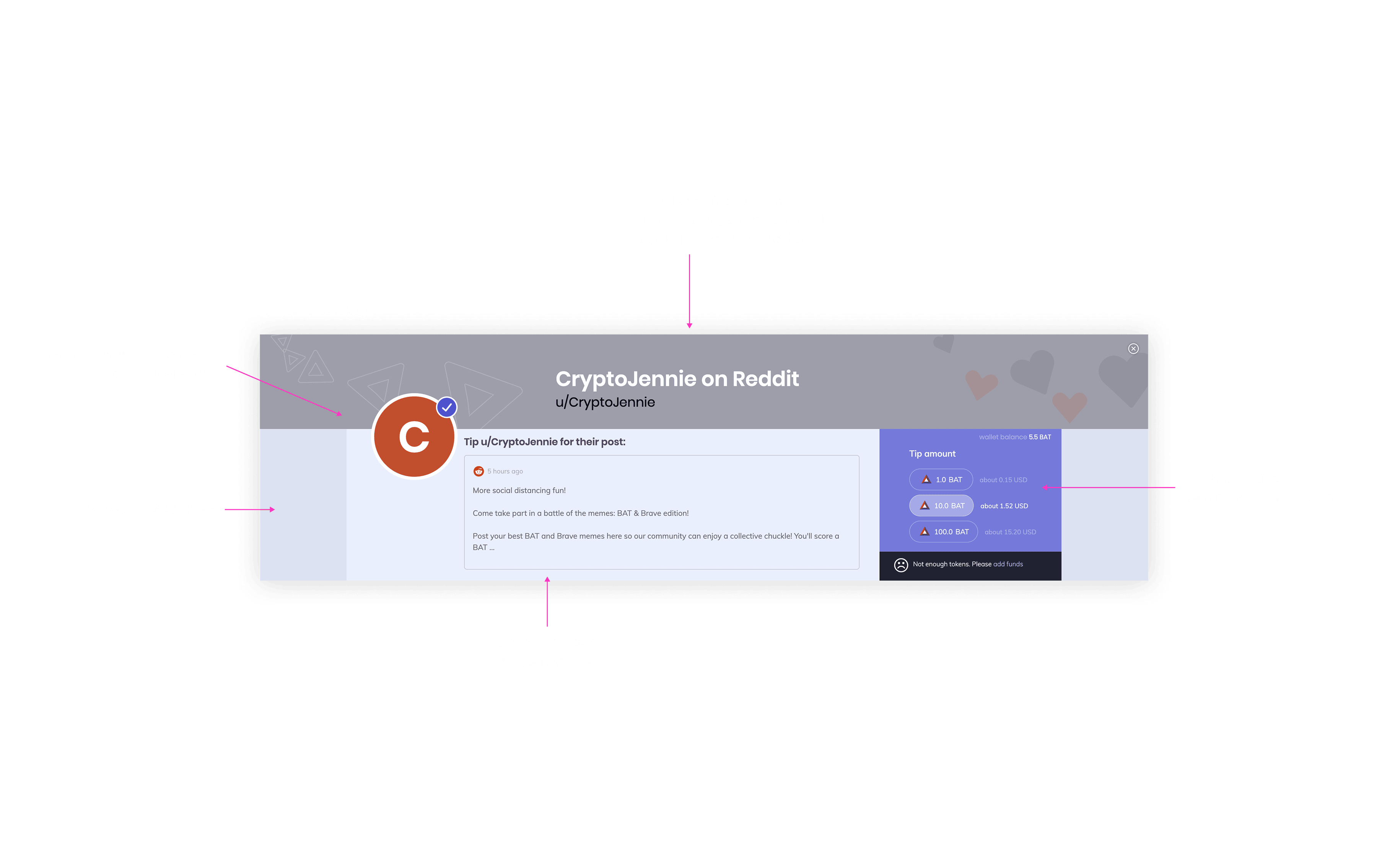
Drilling Down Some More
Identifying pain points in the old banner such as limited functionality, awkward spacing, and limited visual impact.
Tip Your Own Way
The new design increased flexibility to users on when and how much they want to support their favorite creators.
Better Creative
Expanding banner design to offer richer, more personalized and visually engaging experiences for creators and supporters alike.
The Wrap Up
Challenges
-
Unifying a Fragmented Experience
The initial designs were disjointed, making it difficult for users to quickly access key information and features.
-
Stakeholder Alignment
With diverse viewpoints from several internal stakeholders, achieving a unified vision was challenging.
Solutions
-
User Focused
Streamlined the user journey through iterative testing and critique ensuring that every design fixed user issues and not quietly creating new ones.
-
Leading with Testing
Having user testing and interviews helped drive decisions, not just gut reactions from stakeholder meetings.
The Reflection
Be The Big Thinker
As designers, often we find ourselves buried in pixels or fixated on a narrow solution. Sometimes we need to be the one with the larger vision, boldly putting our foot out there and advocating for our users.
Final Thoughts
My time at Brave was instrumental in my growth as a designer. Working intimately with crypto users and the friction of custodial environments for the first time opened my eyes. This meant better messaging in the wallet, improving creator visibility in the tipping banner and a clearer KYC experience.