Redesigning the Brave Rewards ecosystem
Brave Rewards pays people in Basic Attention Token for opting into privacy-respecting ads, and lets them tip creators. When I joined in 2020 the design language across Rewards was stale and well behind the rest of the product. My job was to refresh it and fix the parts of the experience that had stopped working.
- Company
- Brave
- Role
- UX designer
- When
- 2020 – 2021
- Scope
- Wallet, onboarding, tipping banner, component library
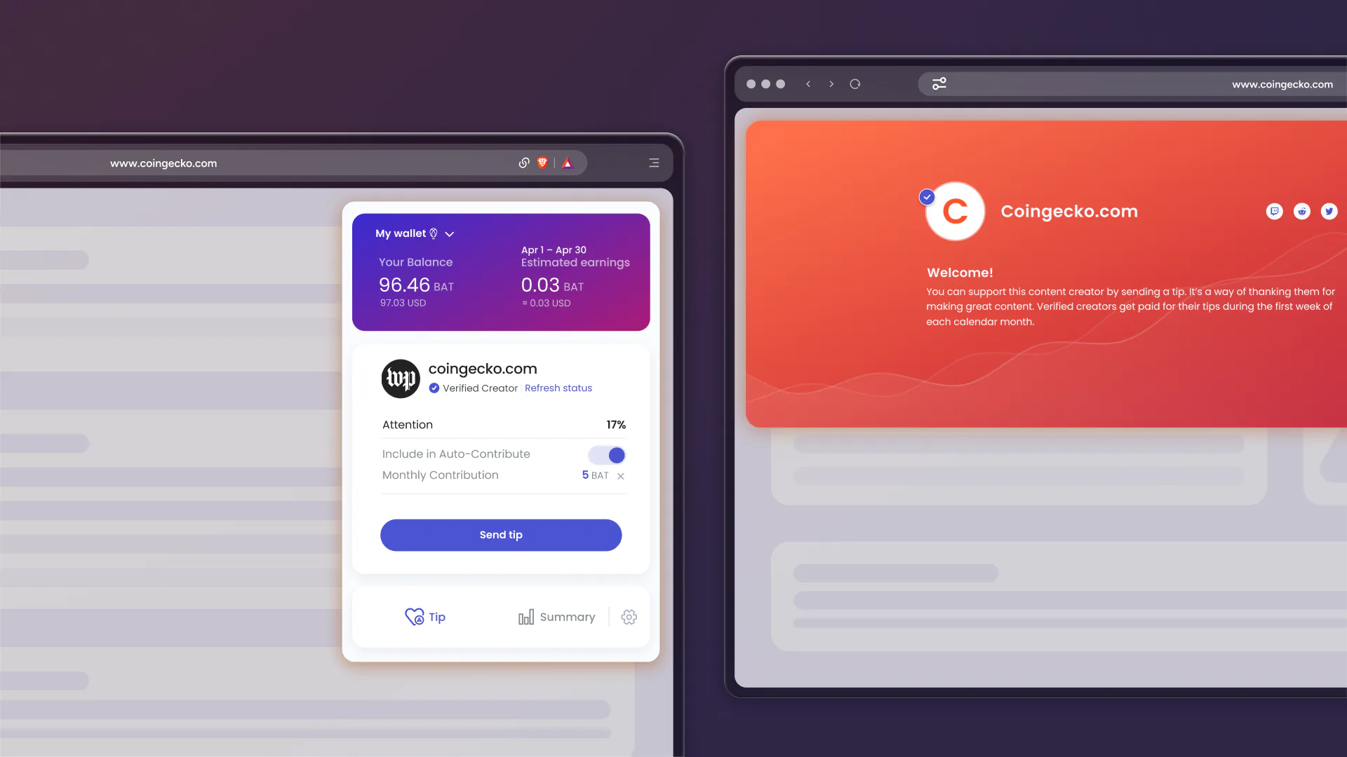
In short
- The Rewards design language was stale and behind the rest of the product.
- Funding states and the tipping panel were the two places people got lost.
- The refresh covered the panel, onboarding, the tipping banner.
- Fewer customer support tickets
- 25%
- Lift in verified creators
- 12%
Problem
Drilling down
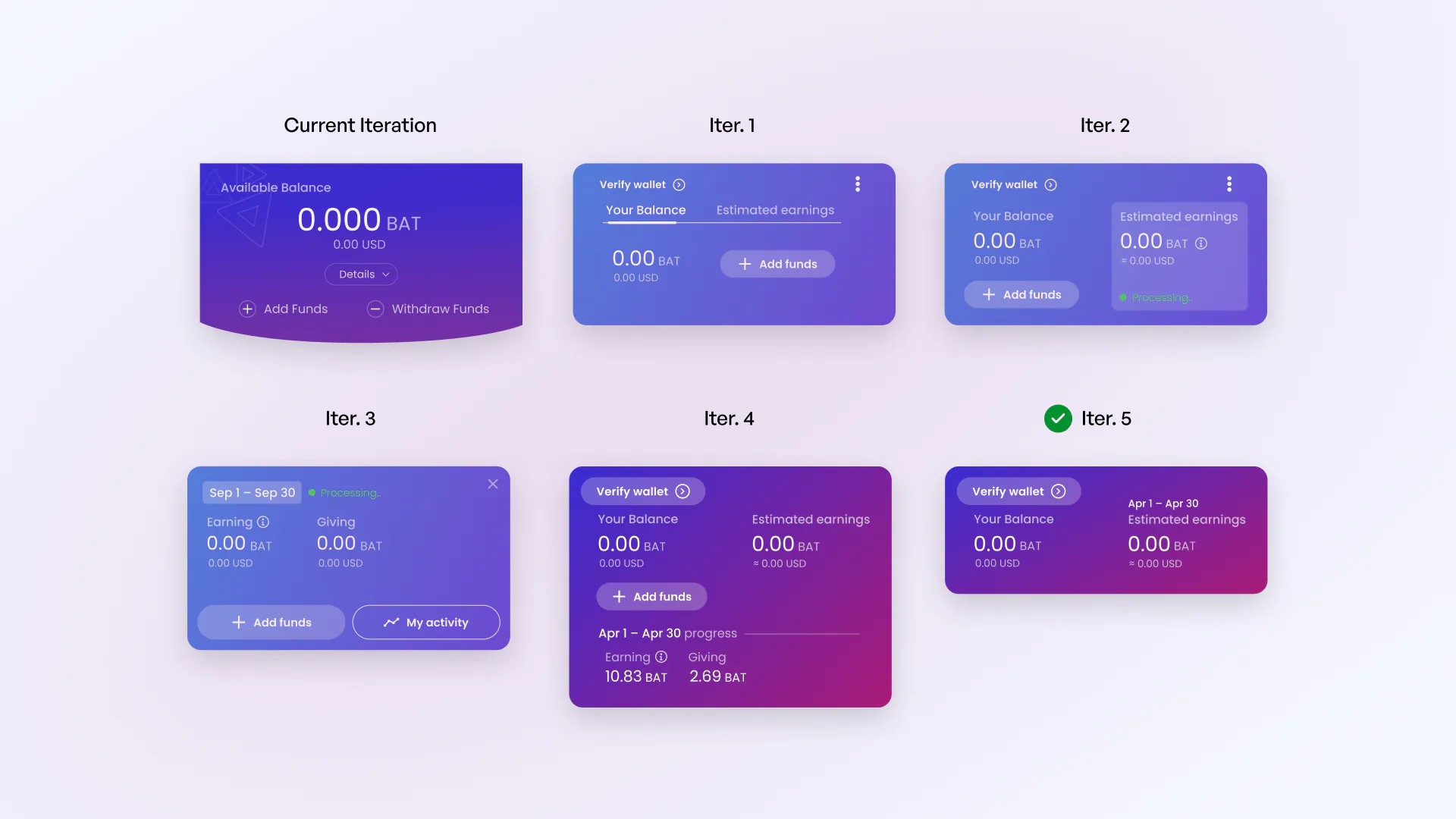
Earnings were hard to read at a glance, navigation had been tacked on, and the surfaces had been visually stagnate.
I started at the balance display and worked out from there, rebuilding the panel in various configurations until we felt we met customer needs.
Trust
Trust and transparency
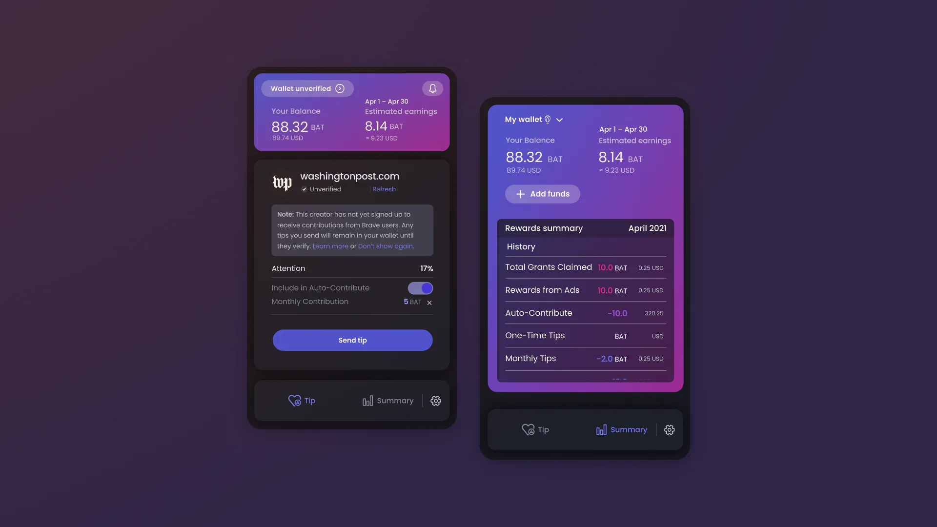
People could not account for their own funds. Moving estimated earnings to the top of the panel did more for confidence than anything else we shipped.
Showing a dedicated summary view was huge in garnering more trust from our users,
States
Notifications
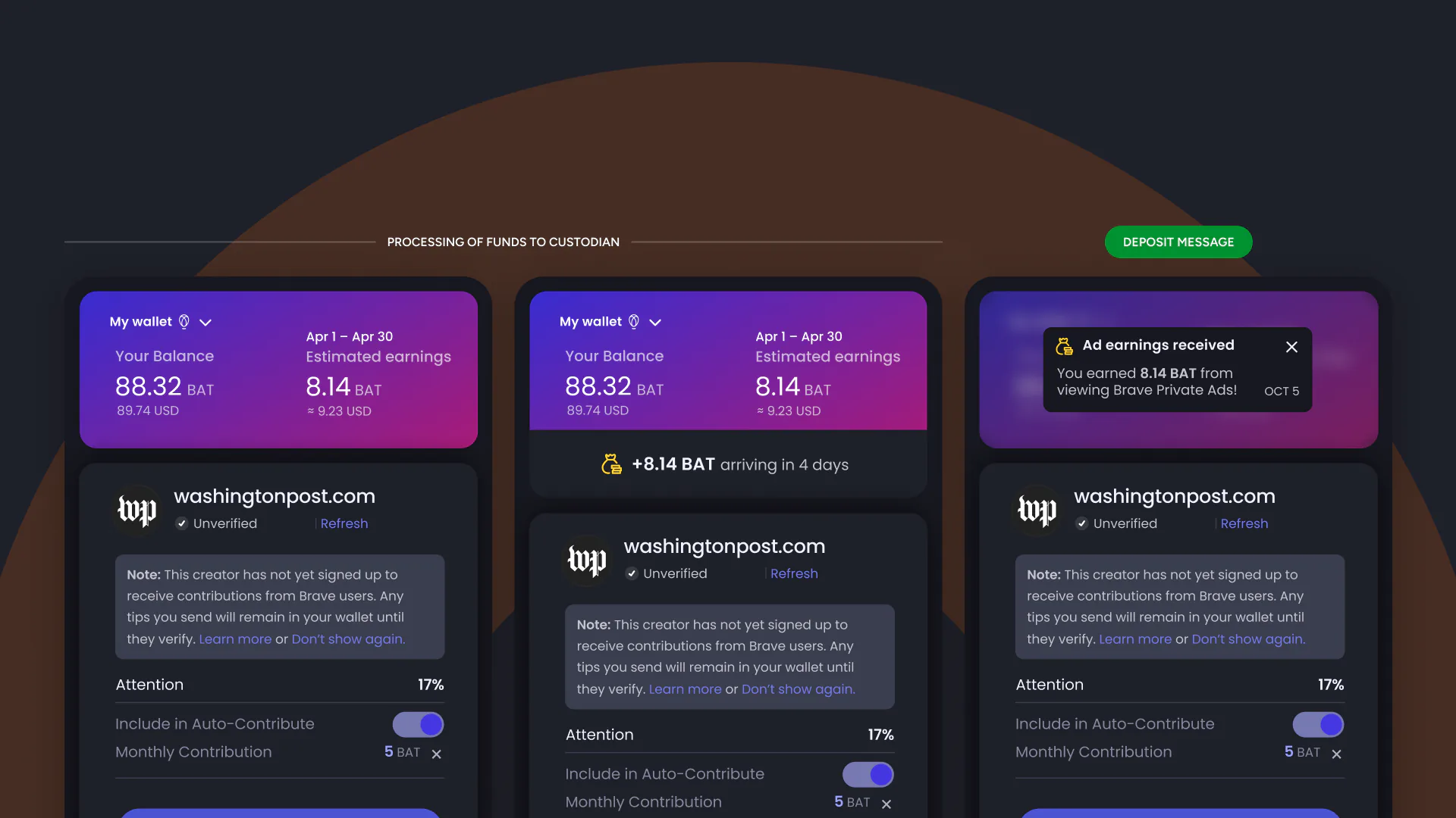
Interviews, reviews and feature requests kept pointing to the same issue. Money moved with nothing communicated to the user.
The panel now names the amount in flight, says when to expect it, and confirms it on arrival.
Tipping
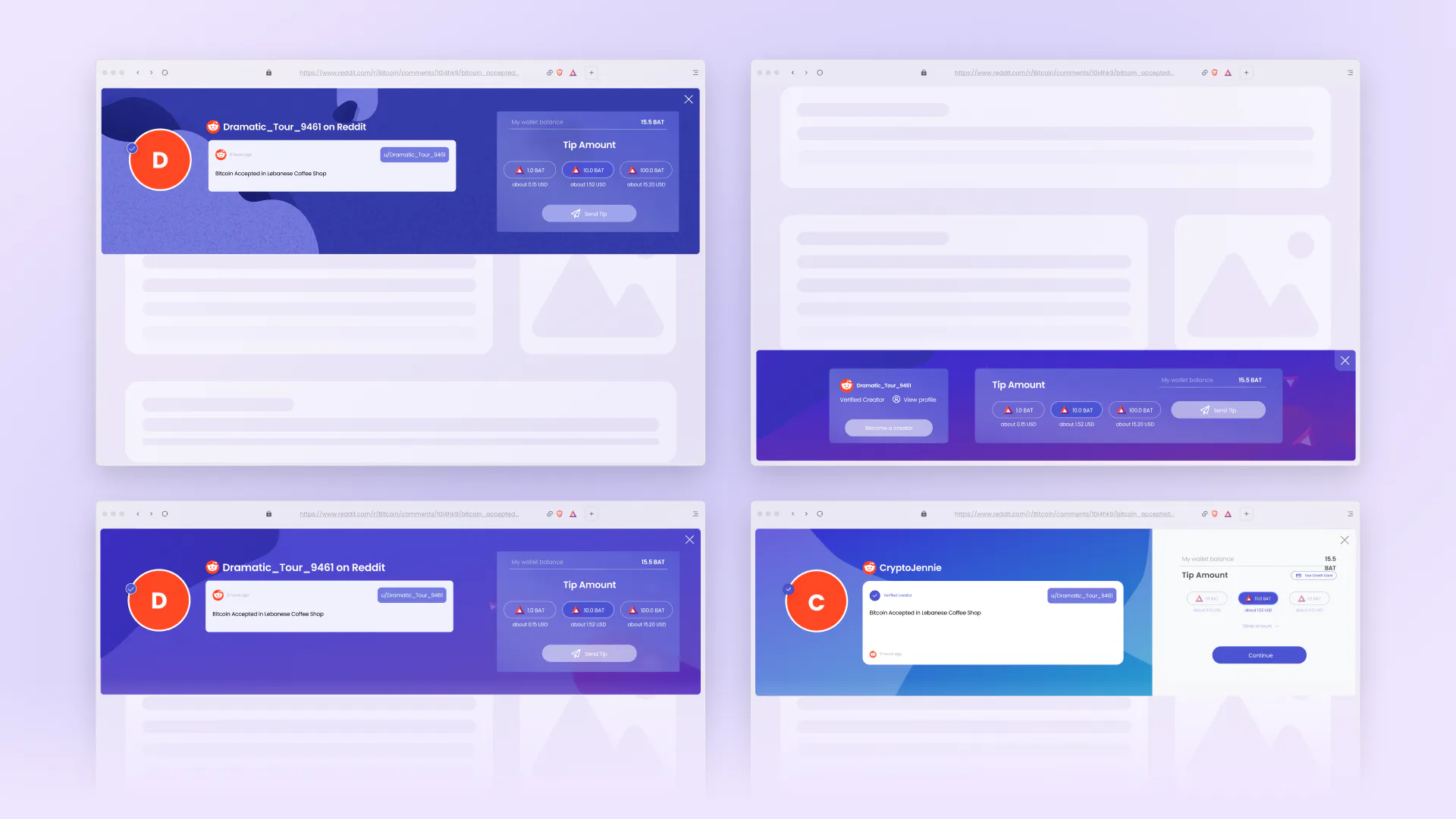
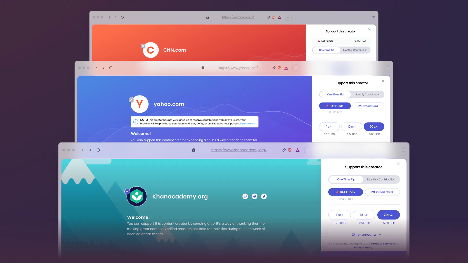
The tipping banner
The old banner was stiff, badly spaced and easy to dismiss.
The new one gives creators a full-width area for artwork and interface with their supports. Adding in pre-determined tipping amounts made the whole experience quick and intuitive,
Library
Building the library
The panel and onboarding resulted in building out a refreshed library of components to meet the needs of our refresh and homogenize the visual language across the product.
Reflection
Be the big thinker
There were a lot of viewpoints to bring together. Testing and user interviews gave us common ground and moved the decisions along.
Brave was my first time working closely with crypto users and the friction of custodial products. It taught me how much clarity matters when a product is holding someone else's money.